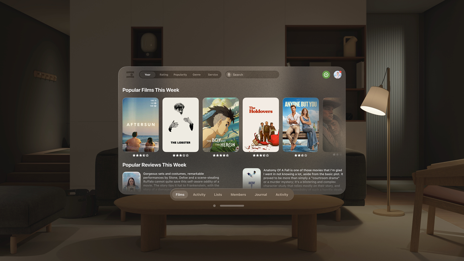
I took on the project of rebranding the social film review and discovery website Letterboxd. I began with a mockup of an application for the Vision Pro given its recent release and immersive video content being its main selling point. My Apple Vision Pro mockup features all the same usability of the website with a cleaner interface, that fits the consistent visual standards of Apple Vision Pro.
Naturally this included a new icon, one that contains the simplicity and playfulness of the app's purpose, while being understandable as a film based concept. The texture behind the logo in the Apple Vision Pro and iOS icons harkens back to film in sunset colors and unique grain.
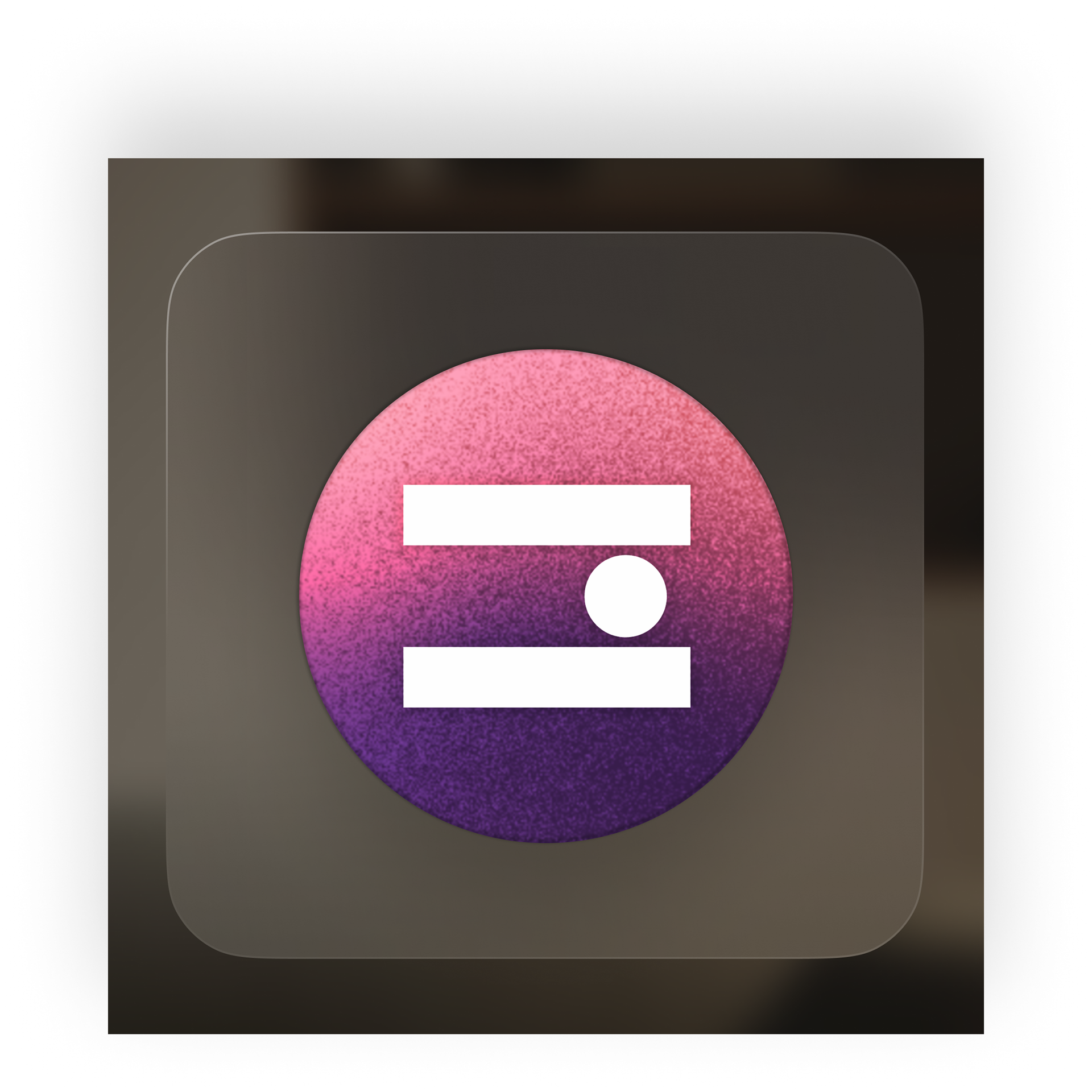
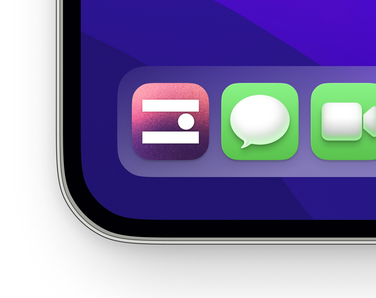
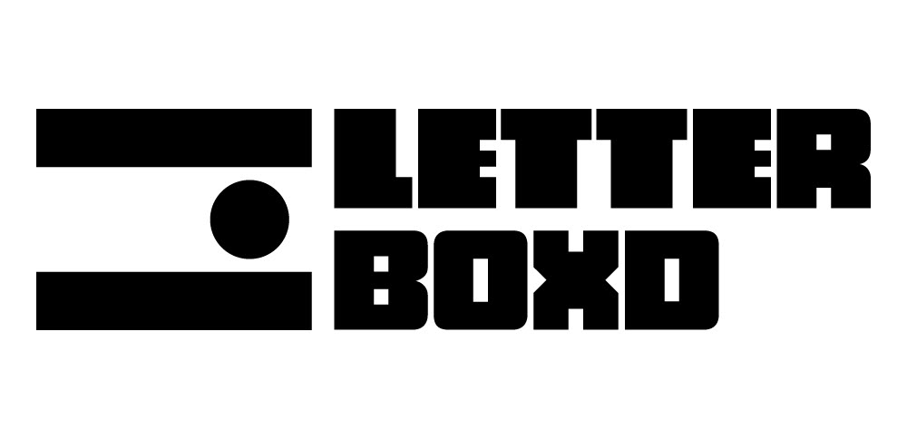
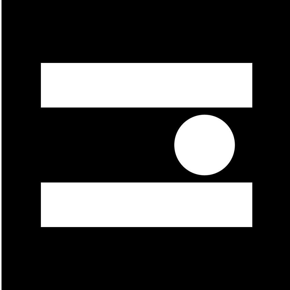
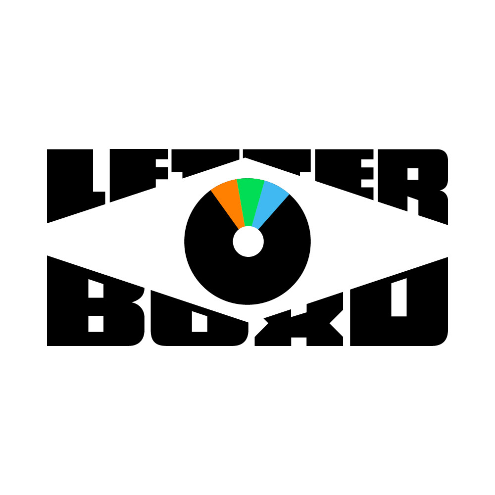
Featuring an abstracted eye looking forward, as well as the bars in a letterboxed film screening, the new icon was created to have the same playful feel as the previous three colored "dot icon" while working much better in monochrome and any color now or in the future.
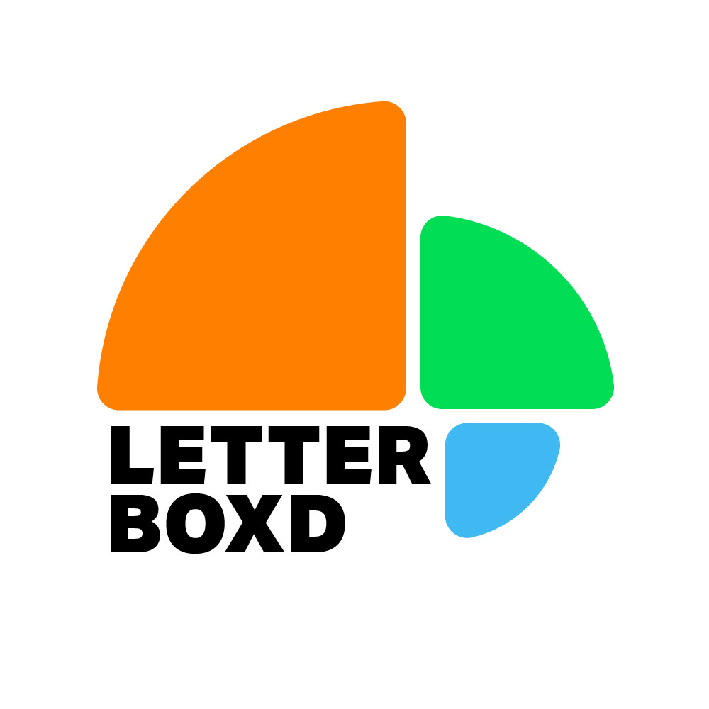
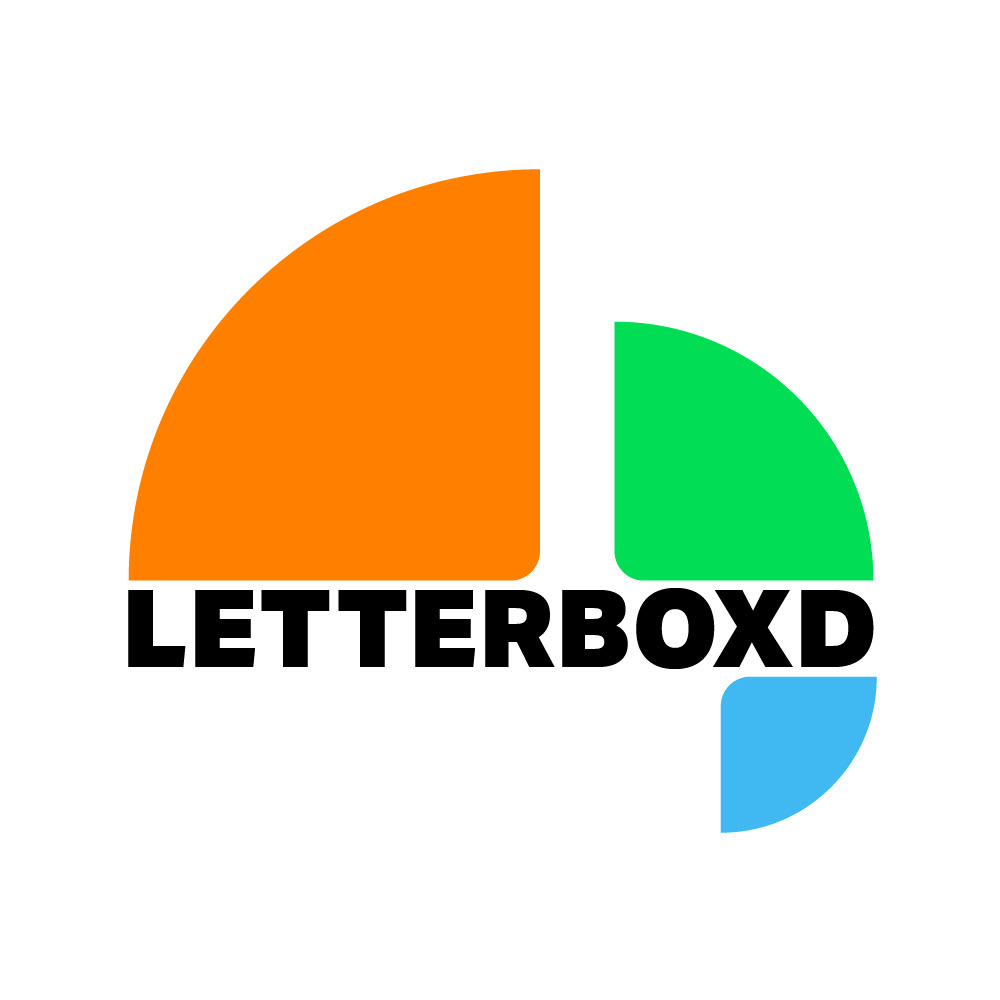
Before the final design was developed, I went through many iterations of ideas, starting with remixes of the existing logo and experimenting on from there.


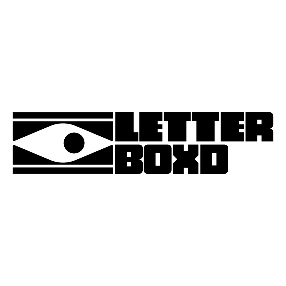
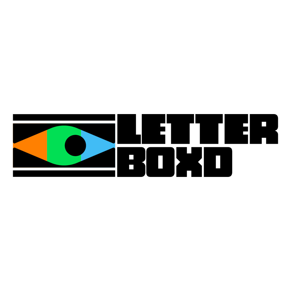
The final design works in any color, any weight, any scale and has endless possibilities for Letterboxd specific animation, as well modifying the inside of the letterbox for a specific film.